10. Descriptive Statistics
Dependency between two variables
The dependency between two quantitative variables is examined using a scatter plot and the correlation coefficient.
Scatter Plot
A scatter plot provides a quick glance at the distribution of values between two variables.
Typically, there is interest in whether high values of x are associated with high values of y, low values of y, or randomly with various values of y.
The example file contains (fictional) course completions, with fields for attendance hours, completed exercises, and exam results.
A scatter plot can be created using matplotlib's df.plot.scatter method.
import pandas as pd
import matplotlib.pyplot as plt
import seaborn as sns
df = pd.read_csv('Datasets/students.txt')
print(df.head())
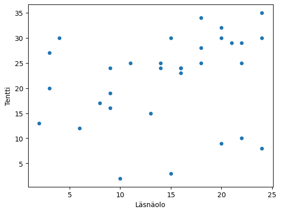
df.plot.scatter('Attendance', 'Exam')
plt.show()
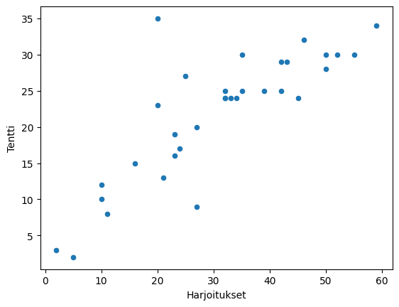
df.plot.scatter('Exercises', 'Exam')
plt.show()
   Attendance  Exercises  Exam
0        20            50      30
1         6            10      12
2        18            59      34
3        18            50      28
4        14            42      25
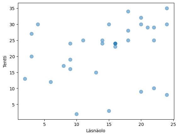
Larger markers can be obtained with the s parameter and translucent ones with the alpha parameter.
df.plot.scatter('Attendance', 'Exam', s=60, alpha=0.5)
plt.show()
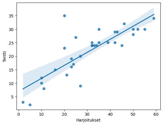
Seaborn's regplot (and jointplot) also create a scatter plot, and with pairplot you can get scatter plots between several variables with one command.
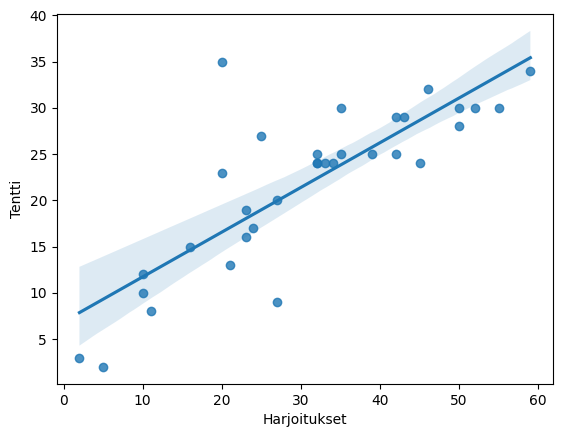
sns.regplot(x='Exercises', y='Exam', data=df)
plt.show()
sns.pairplot(df[['Attendance', 'Exercises', 'Exam']].dropna(), kind='reg')
plt.show()
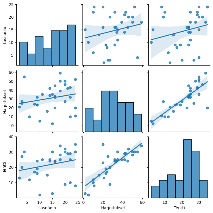
In the example scatter plots, there is no significant connection between attendance and exam scores, as the observation points are quite randomly distributed. Completed exercises, on the other hand, seem to be positively related to the number of exam points. In the scatter plot, this is clearly visible as an ascending cloud of points. Low numbers of completed exercises appear to be related to low exam scores, and high numbers of completed exercises appear to be related to high exam scores.
<a id='2'></a>
## Mean, Variance, and Standard Deviation
Common descriptive statistics for a single variable distribution include the mean and standard deviation:
* mean = sum of values/number of values
* variance = mean of the squared deviations from the mean
* standard deviation = square root of the variance
Thus, for variance, each value's deviation from the mean is calculated and squared.
In Pandas, these can be obtained with DataFrame/Series methods `mean`, `var`, and `std`. The method `describe` provides several descriptive statistics at once
## Covariance
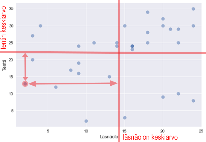
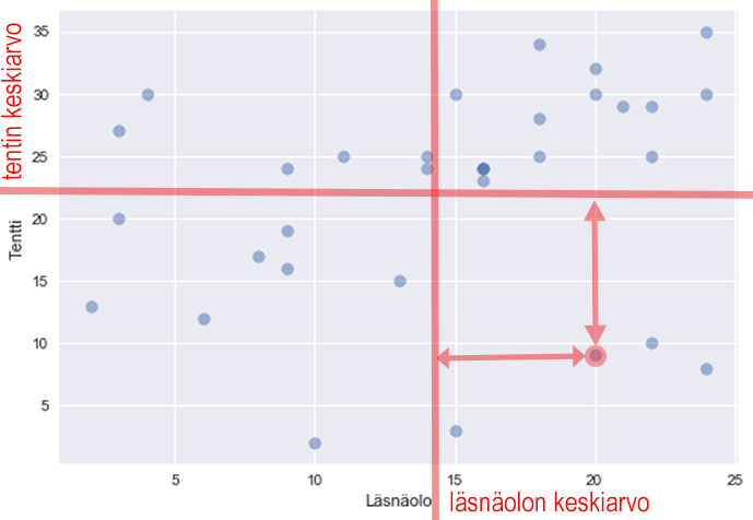
Covariance can be used as a measure of dependence between two variables. It describes how closely "variables vary together". Covariance is calculated using the formula

That is, it is the mean of the product of the deviations of the variables.
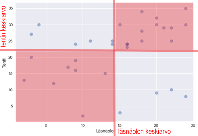
Below, one point is selected and its deviations are plotted:
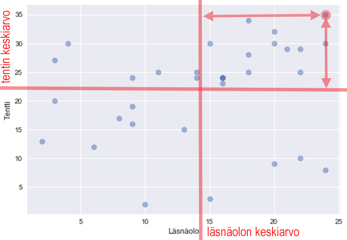
For this, the product of deviations is positive (+ times +).
The product of deviations is also positive for this point (- times -):
However, for this one, one deviation is positive and the other is negative, so the product is negative:
Therefore, the covariance is positive if large values of x are associated with large values of y and small values of x with small values of y, i.e., the points are mostly in these quadrants:
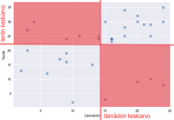
Covariance is negative if large values of x are associated with small values of y and vice versa:
If, on the other hand, the values do not "vary together", i.e., large values of x are associated with both large and small values of y, the covariance is close to zero (there are positive and negative products).
Covariance can be calculated in pandas using the Series `cov` method.
```python
print(df['Attendance'].cov(df['Exam']))
print(df['Exercises'].cov(df['Exam']))
print(df['Attendance'].cov(df['Exercises']))
13.782196969696965
106.54829545454545
21.36931818181818
The DataFrame cov method provides the covariance matrix:
df.cov()
| Attendance | Exercises | Exam | Exerx10 | Undone | |
|---|---|---|---|---|---|
| Attendance | 1.00 | 0.22 | 0.24 | 0.22 | -0.22 |
| Exercises | 0.22 | 1.00 | 0.82 | 1.00 | -1.00 |
| Exam | 0.24 | 0.82 | 1.00 | 0.82 | -0.82 |
| Exerx10 | 0.22 | 1.00 | 0.82 | 1.00 | -1.00 |
| Undone | -0.22 | -1.00 | -0.82 | -1.00 | 1.00 |
With the 'corrwith' method, we can get the correlation of one Series with all columns in the DataFrame:
df.corrwith(df['Exam'])
Attendance     0.238598
Exercises      0.818852
Exam           1.000000
Exerx10        0.818852
Undone        -0.818852
dtype: float64
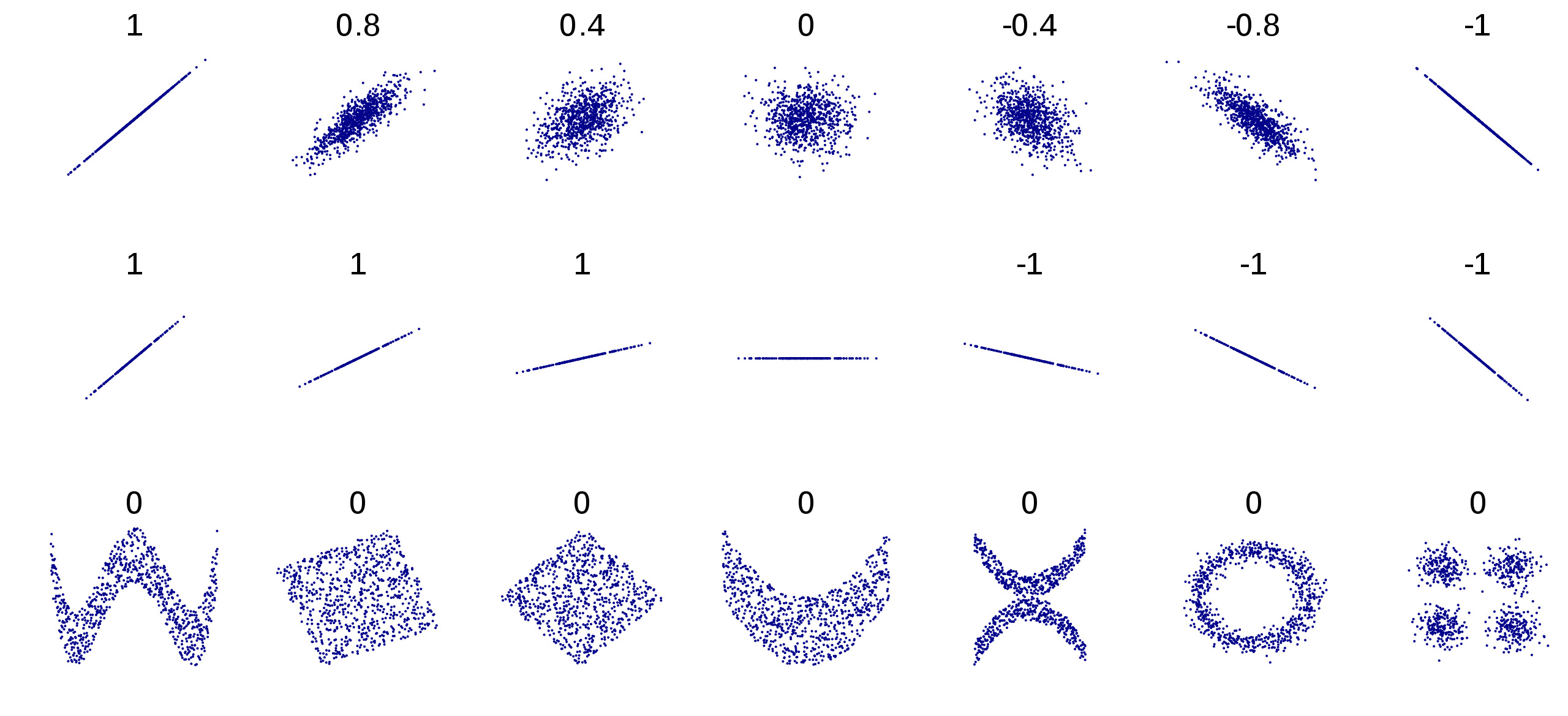
Examples of correlation coefficients for different sets of points:
Coefficient of Determination
The square of Pearson's correlation coefficient (r^2) is often reported as well. For example, if r^2 = 0.32, it is said that the explanatory variable accounts for 32% of the variance of the variable to be explained.
df.corr().applymap(lambda x:"{:.1%}".format(x**2))
| Attendance | Exercises | Exam | Exercisesx10 | Uncompleted | |
|---|---|---|---|---|---|
| Attendance | 100.0% | 4.8% | 5.7% | 4.8% | 4.8% |
| Exercises | 4.8% | 100.0% | 67.1% | 100.0% | 100.0% |
| Exam | 5.7% | 67.1% | 100.0% | 67.1% | 67.1% |
| Exercisesx10 | 4.8% | 100.0% | 67.1% | 100.0% | 100.0% |
| Uncompleted | 4.8% | 100.0% | 67.1% | 100.0% | 100.0% |
Pitfalls of the Correlation Coefficient
Correlation does not imply causation
Correlation can be a coincidence due to a small sample size. It may also be that y is caused by x or vice versa, or there may be a third factor causing both, for example, more drownings occur when more ice cream is eaten, but the weather (heat) is obviously the background for both.
Correlation measures only linear dependence
There can be dependence between variables even if it is not linear, for example, y = x^2 -100x +2500 gives high values of y for small and large values of x
import numpy as np


df2 = pd.DataFrame({'x': np.linspace(0,100,10000)})
df2['y'] = df2['x']**2-100*df2['x']+2500


df2.plot.scatter('x','y')
plt.show()


print('correlation coefficient: ', df2['x'].corr(df2['y']))  # correlation coefficient 0
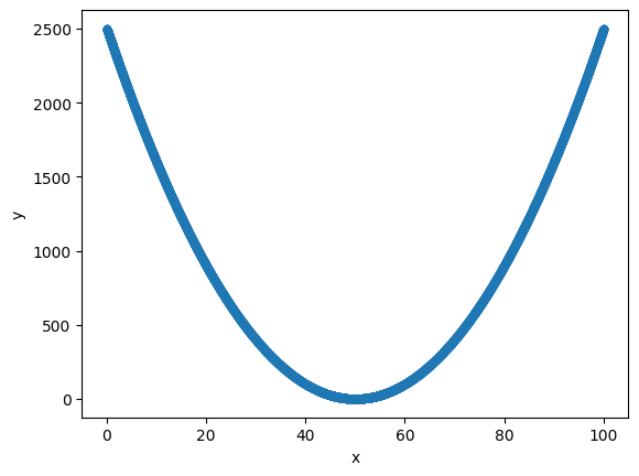
    correlation coefficient:  -9.519615438353006e-17


### Outliers
Individual outliers can greatly affect the value of the correlation coefficient, which is why it is always recommended to print the scatter plot of the variables under study.


```python
df = pd.read_csv('Datasets/students.txt')
print(df.head())


sns.regplot(x='Exercises', y='Exam', data=df)
plt.show()
print('correlation coefficient: ', df['Exercises'].corr(df['Exam']))
   Attendance  Exercises  Exam
0        20          50    30
1         6          10    12
2        18          59    34
3        18          50    28
4        14          42    25
correlation coefficient: 0.8188523219755871
# change 1 value
df.iloc[-1] = [12,60,1]


sns.regplot(x='Exercises', y='Exam', data=df)
plt.show()
print('correlation coefficient: ', df['Exercises'].corr(df['Exam']))
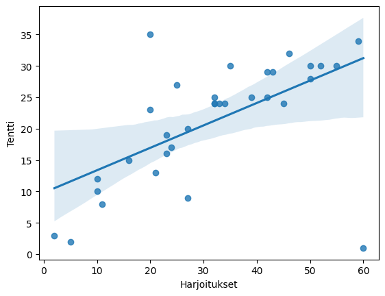
correlation coefficient: 0.5916215121858927
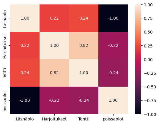
Correlation Matrix as a Heatmap
The Seaborn library offers an illustrative heatmap "chart" for visualizing the correlation matrix:
df = pd.read_csv('Datasets/students.txt')


df['absences'] = 24-df['Attendance']


sns.heatmap(df.corr(), annot=True, fmt=".2f")
plt.show()
The same for the good old Titanic dataset:
titanic = sns.load_dataset('titanic')
sns.heatmap(titanic.corr(), annot=True, fmt=".2f")
plt.show()
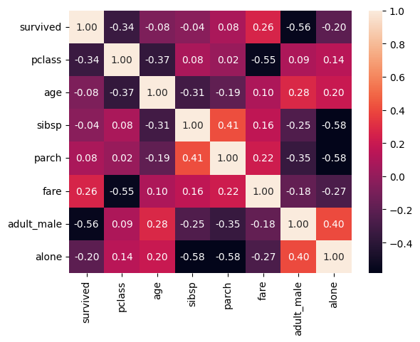
annot=True makes seaborn also print the numbers and fmt=".2f" sets them to 2 decimal places
```